
 SEO & Content
 Paid Media
 Social Media
 Design & Development
 Branding
 Lead Generation
 White Label





Simba
Simba
Simba trades as Flavours of India, an Indian street food kitchen. The menu runs on kathi rolls, samosa chaat, curry bowls, tikka masala, korma and combo thalis, with a vegan and vegetarian marker against most of it.
- 01How they came inA street food menu that needed to be readable at a counter and still feel like a proper brand.
- 02What we took onThe visual language and the printed menu, plus a wide campaign banner in the same system.
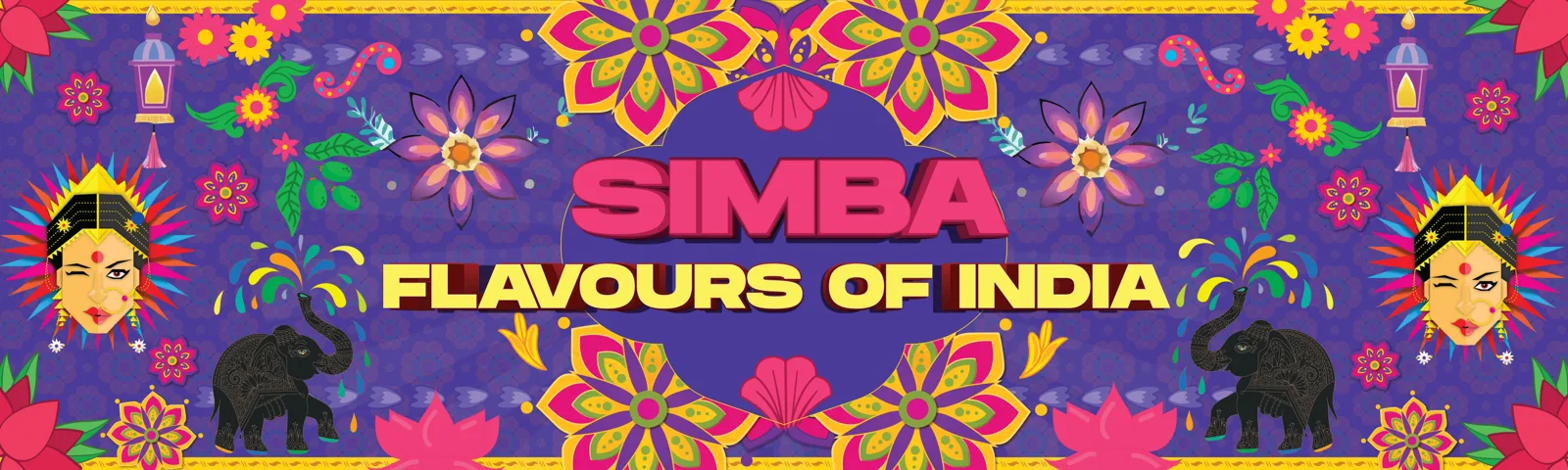
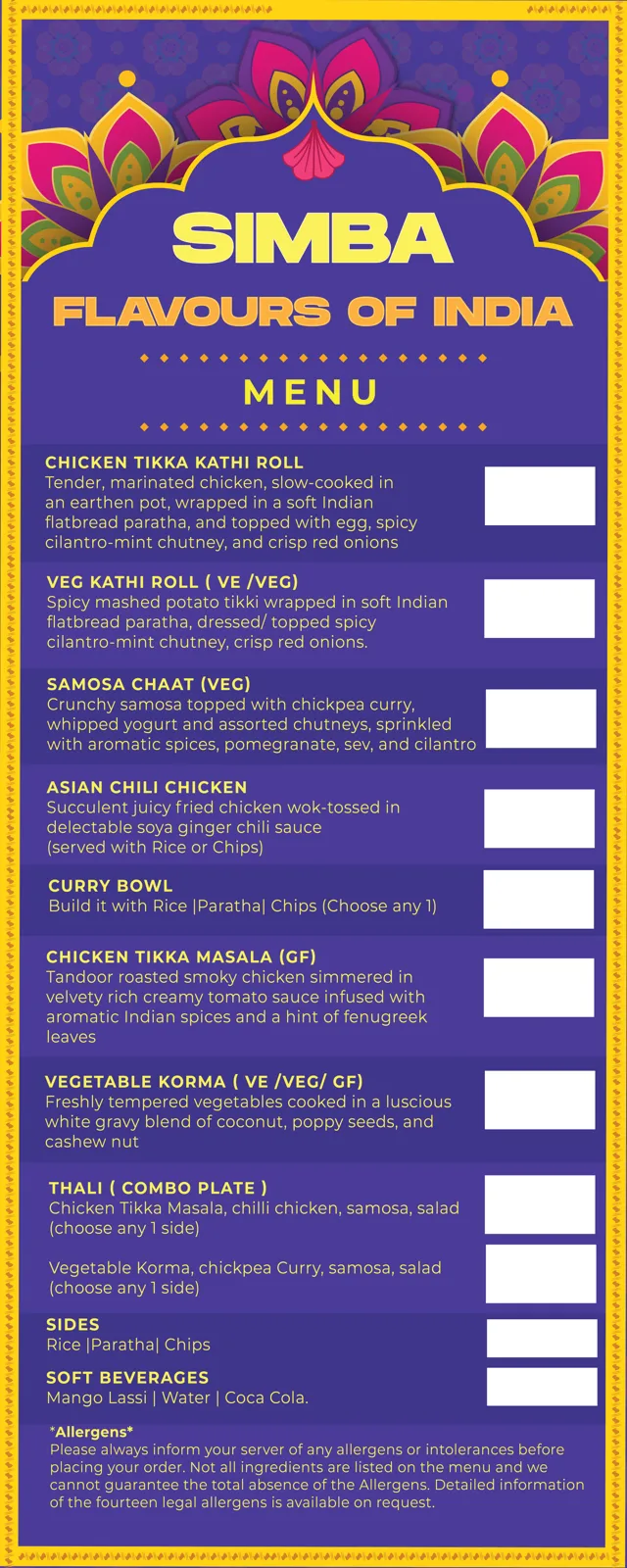
- 03How it runsA deep purple base with mandala arches, marigold borders, elephants and lotus motifs. Two menu routes were designed: a tight single-column list with colour-blocked bands, and a bolder version with display headlines for each dish.
- 04Where it standsTwo menu designs and one banner are on this page. Allergen wording sits at the foot of both menus.
Campaigns and posters
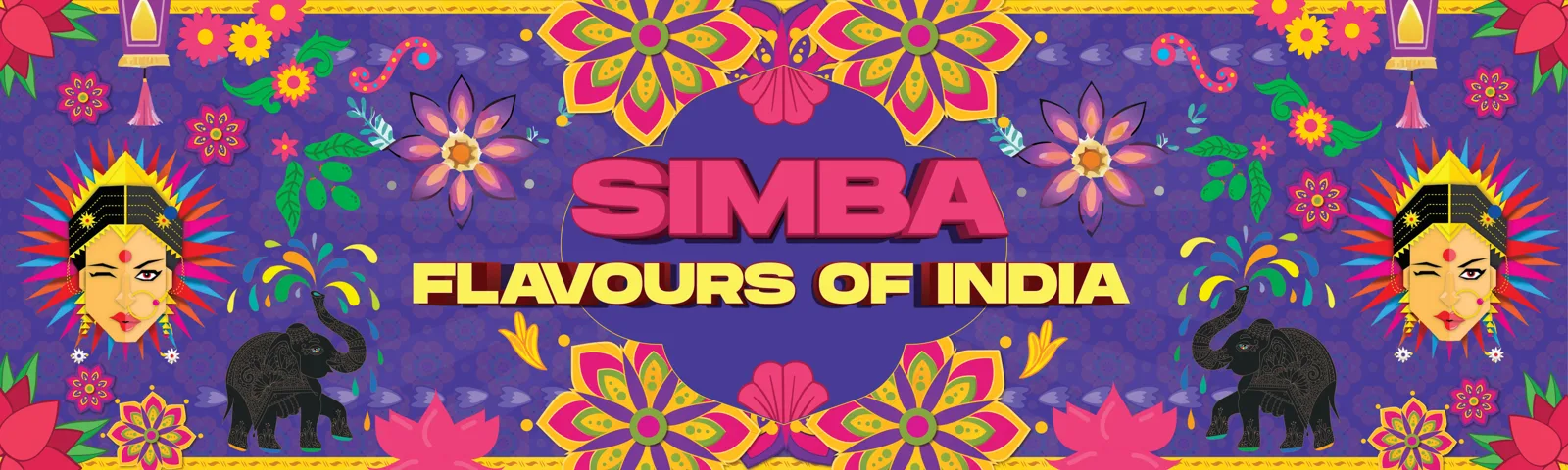
A wide banner in the Simba system: purple base, mandala florals, elephants and lanterns framing the Flavours of India lockup.
“A street food menu has about three seconds to be read. Everything else is decoration around that.”
MarketinCrew
Print and packaging
Two printed menu routes. One is a compact colour-banded list with allergen and vegan markers, the other opens each dish with a display headline over a full mandala arch.
Photography
4 pieces we made for Simba
3 banners & ads · 1 menu design

Asked about this work
Why two menu versions?
One is built for density, when the full range has to fit a single sheet. The other trades a few items for legibility at a distance.
How is diet marked?
Vegan, vegetarian and gluten free markers sit inside each dish title, with the allergen note held at the foot of the menu.
Does the identity extend past the menu?
Yes. The same palette, mandala arches and motif set carry into banner and campaign artwork.
Want work like this for your brand?
One team across the brand, the feed, the ads and the shoots.
Get your marketing audited →