 SEO & Content
 Paid Media
 Social Media
 Design & Development
 Branding
 Lead Generation
 White Label




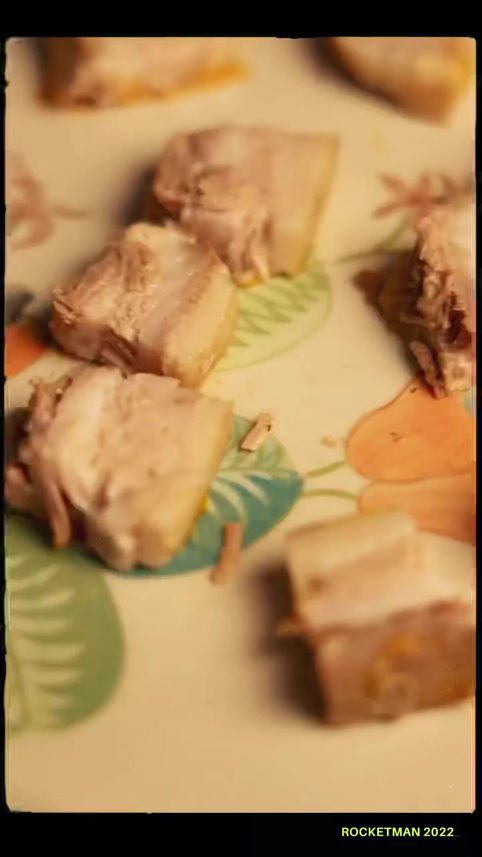
Rocketman Pizzeria
HospitalityThe client
Rocketman Pizzeria
Rocketman is a Detroit style pizzeria. Square pans, thick caramelised cheese edges, and a line the brand puts on its own artwork: square and proud, Detroit by design.
- 01How they came inDetroit style pizza is a shape most people have not eaten. The pan, the corners and the cheese edge are the whole argument, so the pictures had to carry it.
- 02What we took onThe ongoing social account plus a full photography library of the menu.
- 03How it runsPizzas are shot in the pan and straight down, so the square reads immediately, then again in the hand mid slice. Campaign frames run deep navy with the brand line repeated as a type block, and the photography frames wrap the picture in a repeating square and proud border with the R mark. Wood, steel and paper are the only surfaces used.
- 04Where it standsThirty two photography pieces and five campaign frames in the set.
The work
Campaigns and posters
Deep navy frames with the brand line set as a repeating type block against pizza being served, cut and eaten.
“Square and proud. Detroit by design.”
Rocketman, brand line
The work
Photography
Thirty two shots of the pan pizzas, overhead and in the hand, each wrapped in the repeating square and proud border.
Photography assets32
Campaign assets5
StyleDetroit style pizza
Questions
Asked about this work
What did MarketinCrew do for Rocketman?
Ran the social account and built the food photography library behind it.
Why is everything shot from overhead?
Detroit style pizza is square and baked in a pan. Straight down is the angle that shows it.
How many assets are in the set?
Thirty two photography pieces and five campaign frames.

Rocketman Pizzeria
Want work like this for your brand?
One team across the brand, the feed, the ads and the shoots.
Get your marketing audited →